In our Krea 2 setup guide we mentioned in passing that optional style LoRAs existed. What we didn’t expect: sitting down to test all of them with the same image for this article, we found two things — the LoRA catalog had changed since July (three we documented no longer exist), and most of them, without the correct activation phrase, barely do anything. This article is the real comparison, with both versions (without and with the trigger word) so you can see the difference yourself.
At a glance: the 9 real style LoRAs
| LoRA | Trigger phrase | Resulting style |
|---|---|---|
krea2_darkbrush | monochrome ink wash style | Monochrome ink, loose brushwork |
krea2_dotmatrix | monochrome stippling style | Fine black-and-white stippling |
krea2_kidsdrawing | naive expressive sketch style | Expressive hand-drawn sketch, thick lines |
krea2_neondrip | textured abstract style | Abstract oil painting, saturated colors |
krea2_rainywindow | rainy window style | Rain-streaked glass overlay effect |
krea2_retroanime | purple retro anime style | 80s/90s anime, purple-dominant palette |
krea2_softwatercolor | art deco watercolor style | Watercolor with art deco linework |
krea2_sunsetblur | ethereal motion blur style | Ethereal motion blur, warm tones |
krea2_vintagetarot | vintage tarot style | Vintage tarot-card illustration, flat colors |
Recommended strength: 1.0 for all 9. They’re all in Comfy-Org/Krea-2/loras on HuggingFace, 469 MB each.
⚠️ Correction to our original guide: we published the setup guide on 2026-07-03 listing
krea2_coolblue,krea2_plasmoidandkrea2_warmpastelas available. While preparing this comparison on 2026-07-07 we verified all three now return 404 — Comfy-Org rotated the style catalog in those four days. The table above is what’s real today.
Methodology: same image, same seed, one variable
For a fair comparison, we generated all 9 versions (plus a no-LoRA baseline) with:
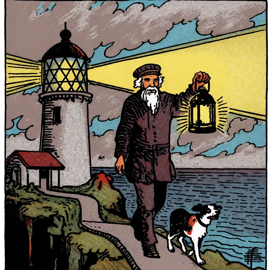
- Same base prompt: an elderly lighthouse keeper walking a cliff path at dusk with a lantern and a dog, plus each LoRA’s trigger phrase.
- Same seed:
424242. - Same KSampler parameters: 8 steps, cfg 1.0,
euler/simple, denoise 1.0 — the same ones verified in the setup guide. - Same strength_model: 1.0 across the board.
- Variable between images: the LoRA loaded via
LoraLoaderModelOnlyand its matching trigger phrase, added to the prompt alongside it.
That way, any visual difference between images comes from the LoRA and/or its trigger phrase, not the seed. Note: we didn’t isolate whether the effect comes from the LoRA weights, the added prompt words, or both — see the limitation noted below, in the finding section.
Reference: no LoRA
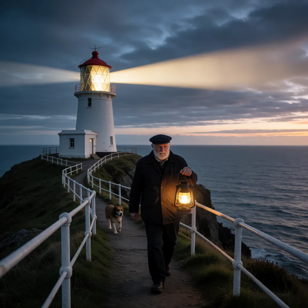 Photorealistic, as expected from the base Krea 2 Turbo checkpoint with no LoRAs.
The finding: without the trigger word, they lose their specific character — not “nothing happens”
Before writing the final table, we tested all 9 LoRAs at strength 1.0 but without adding their trigger phrase to the prompt, and we published all 9 resulting images — not just a description.
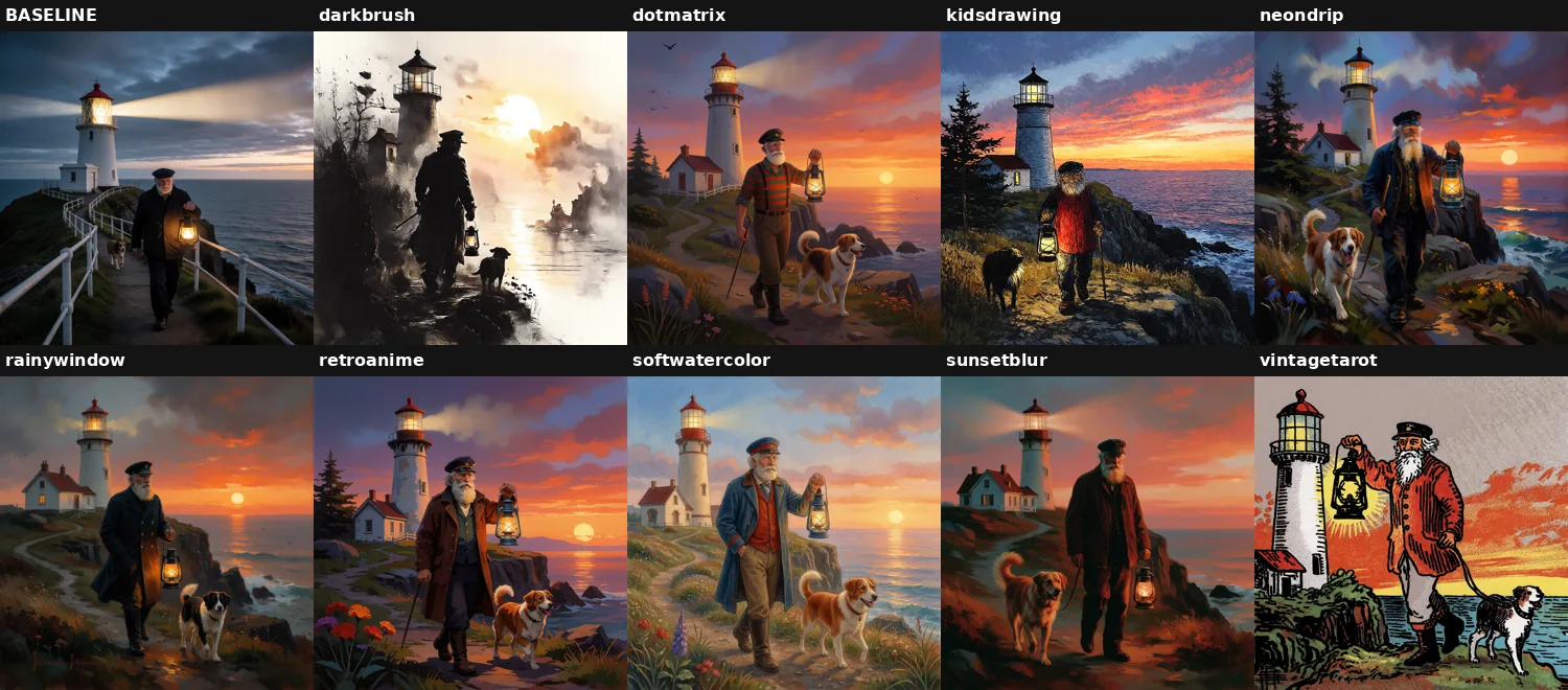 All 9 versions without the trigger word, same prompt and seed as the rest of the article, next to the baseline. Compare them against the full comparison further down.
Real result, verified image by image: 2 of the 9 (darkbrush, vintagetarot) keep a strong, clearly recognizable style even without the trigger phrase. The other 7 (dotmatrix, kidsdrawing, neondrip, rainywindow, retroanime, softwatercolor, sunsetblur) do move away from the photorealistic baseline — none of the 9 stays identical to the no-LoRA image — but they converge toward a very similar generic painterly/illustrated look instead of showing their specific style. rainywindow without the trigger has no rain-drop effect at all; retroanime without the trigger has no purple palette or anime look; they’re all just “a sunset illustration” indistinguishable from the other 6.
Only after adding each model’s exact phrase (confirmed in the repo’s official README) did all 9 LoRAs show their particular, individual style. The practical takeaway: if you load a Krea 2 style LoRA and the result isn’t what you expected, check for a missing trigger word first — not because the LoRA “does nothing” without it, but because without it they all converge toward a similar generic style instead of showing their own.
⚠️ Limitation of this test: we didn’t run the reverse control (the trigger phrase in the prompt, but without the LoRA loaded) to rule out that part of the style shift comes from the prompt words alone rather than the LoRA itself. Since 7 of the 9 produce a similar generic effect without the trigger, it’s reasonable to suspect at least part of the “style” comes from the LoRA itself (beyond the text), but we haven’t isolated that with this control. Left as a follow-up test.
Full comparison (with trigger word)
krea2_darkbrush — monochrome ink
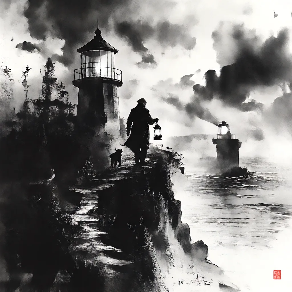 Trigger:
 monochrome ink wash style. The most dramatic of the 9, turns the sunset into near-total backlight.
krea2_dotmatrix — stippling
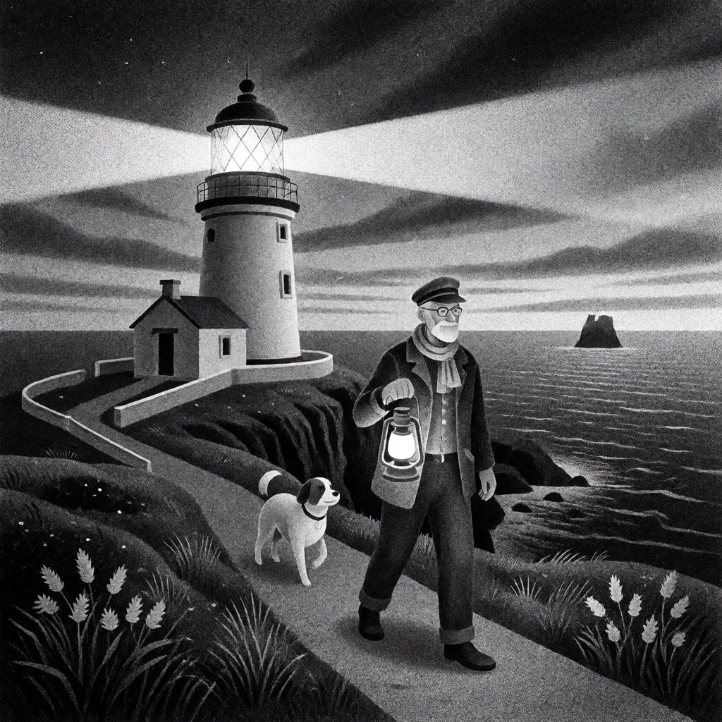 Trigger:
 monochrome stippling style. Consistent grainy texture throughout, well suited to editorial illustration.
krea2_kidsdrawing — expressive sketch
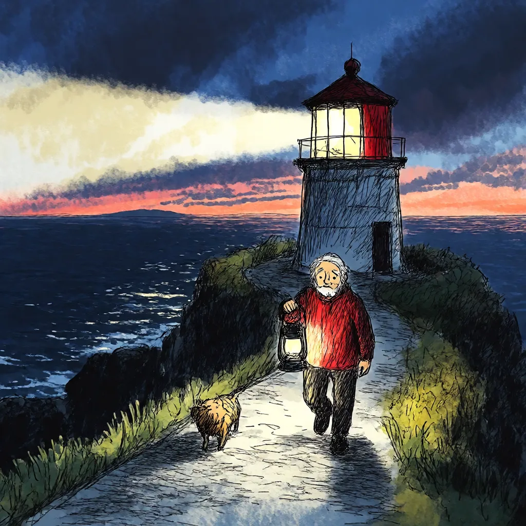 Trigger:
 naive expressive sketch style. Thick, deliberately imperfect linework — unlike the other 8, it isn’t going for “pretty,” it’s going for spontaneous.
krea2_neondrip — abstract oil
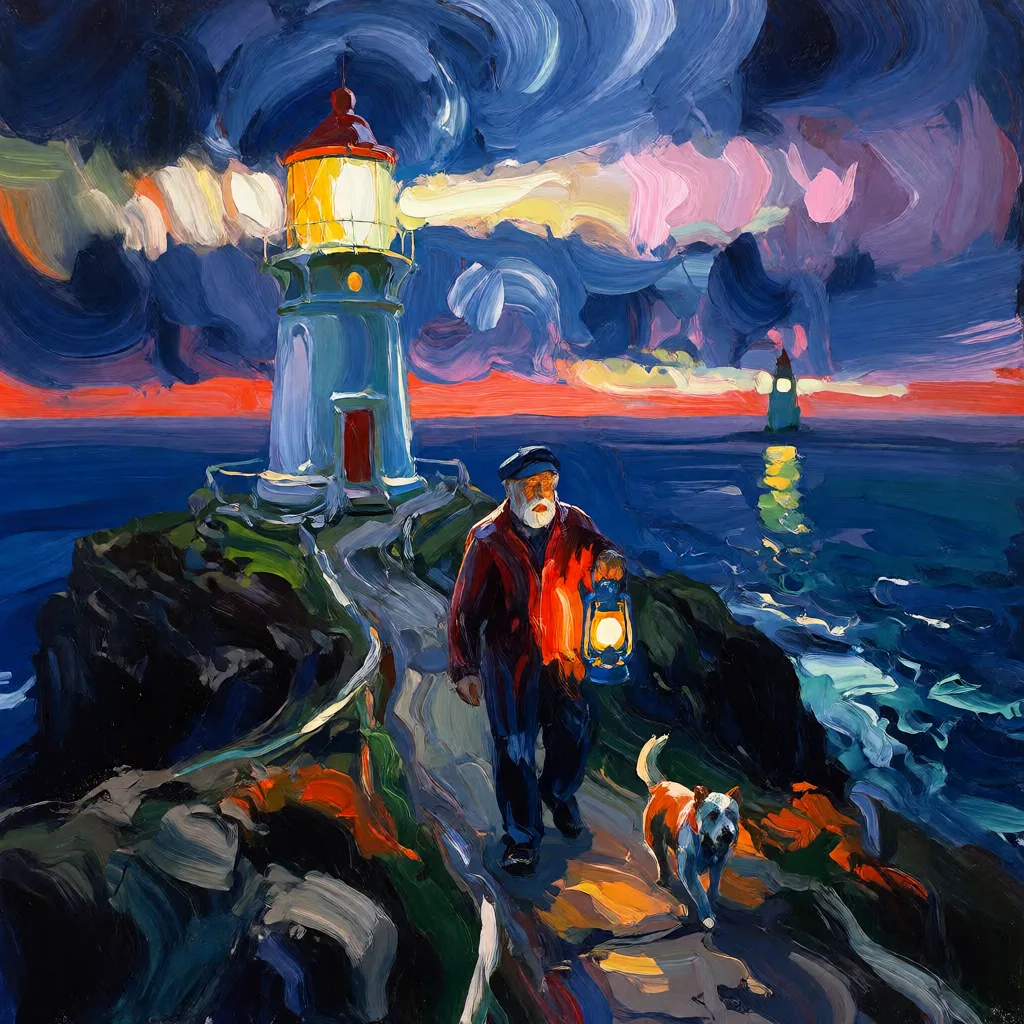 Trigger:
 textured abstract style. The name suggests neon, but the actual result reads more as expressionist painting than graffiti — watch out for filename-driven expectations.
krea2_rainywindow — rain-streaked glass
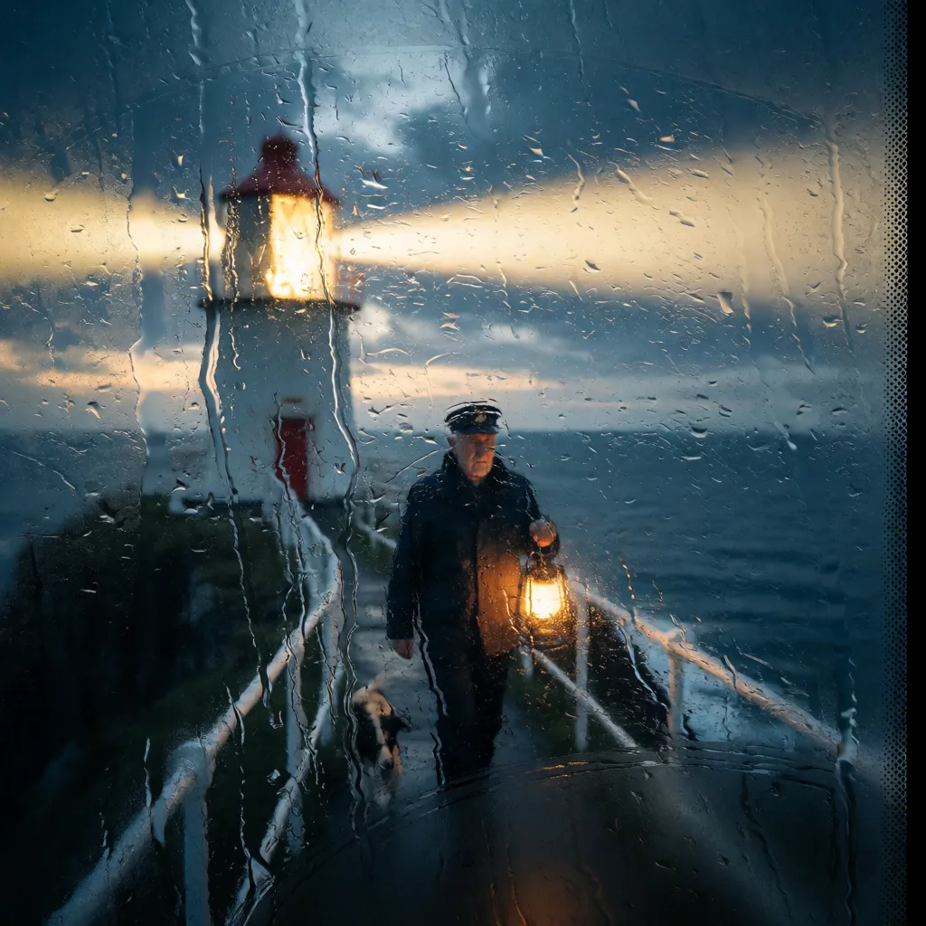 Trigger:
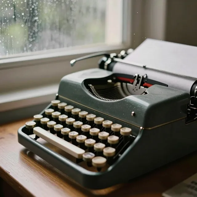
 rainy window style. The only one of the 9 that adds a physical element (raindrops) instead of just changing texture/palette — useful for composition, not just style.
krea2_retroanime — purple retro anime
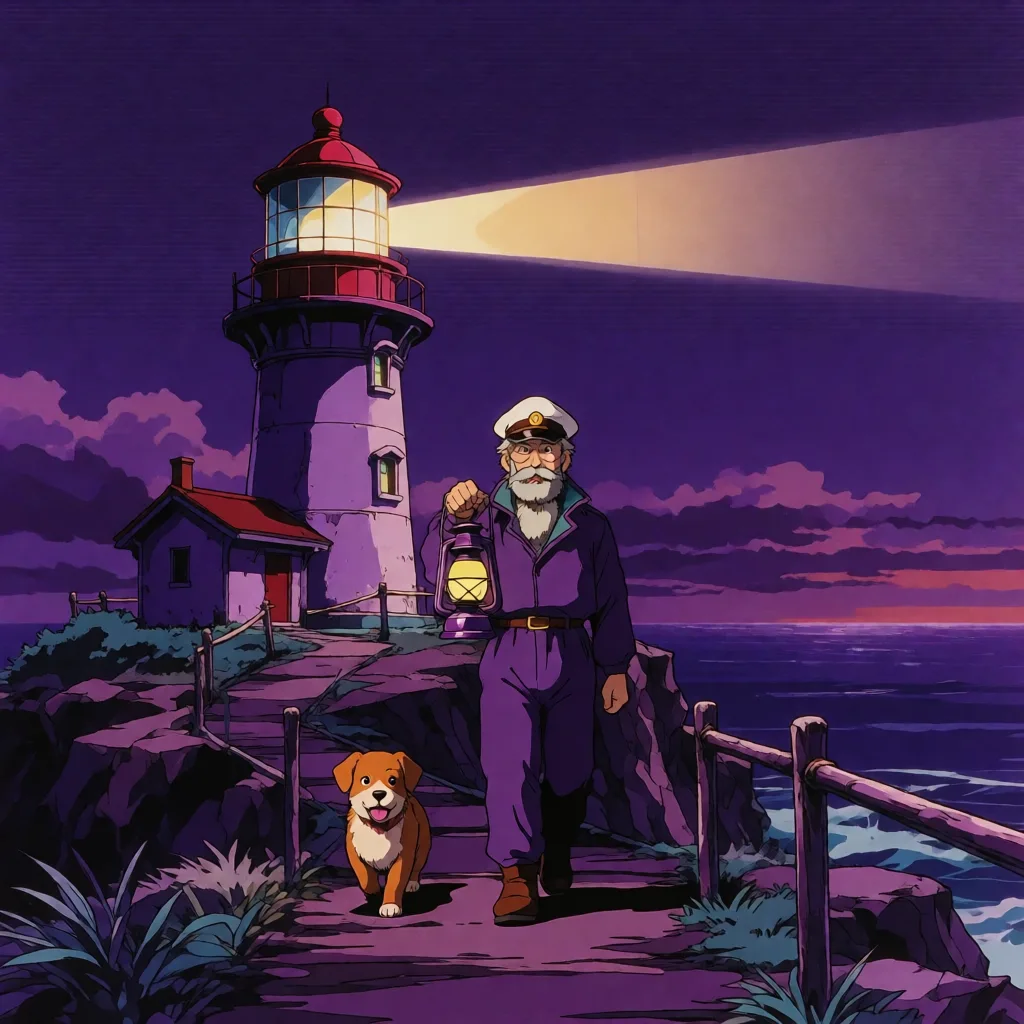 Trigger:
 purple retro anime style. A strongly purple palette even without asking for it explicitly in the prompt — it’s baked into the LoRA.
krea2_softwatercolor — art deco watercolor
 Trigger:
 art deco watercolor style. The most “editorial” of the 9, with clean outlines over watercolor washes.
krea2_sunsetblur — ethereal blur
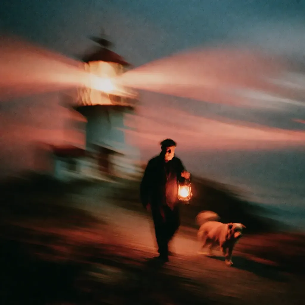 Trigger:
 ethereal motion blur style. The only one that sacrifices subject sharpness entirely — the keeper and the dog become almost unrecognizable.
krea2_vintagetarot — vintage tarot card
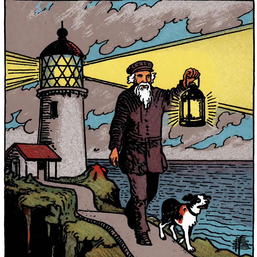 Trigger:
 vintage tarot style. Flat colors and near-heraldic composition — the second-strongest of the 9, alongside darkbrush.
Micro-conclusion: which one to use?
- For editorial/blog illustration:
softwatercolorordotmatrix— legible, won’t fight with overlaid text. - For covers or thumbnails that need impact:
vintagetarotordarkbrush— these deviate most from the baseline and stand out in a feed. - For narrative composition (not just style):
rainywindowis the only one that adds a scene element rather than just texture. - Avoid if the subject needs to stay recognizable:
sunsetblurblurs too much for portraits or product shots.
How to replicate this in your own workflow
Reuse the flat workflow from the setup guide: the only change is inserting a LoraLoaderModelOnly node between UNETLoader and KSampler, with lora_name pointing to whichever LoRA you want and strength_model set to 1.0. Then add the trigger phrase from the table above to the start of your positive prompt — that’s the step we missed the first time, and it’s the whole finding behind this article.
Keep reading
If you haven’t set up Krea 2 yet, start with the full setup guide, which covers the exact base model paths and the workflow that avoids the official template’s subgraph bug.
🏆 Our recommendation
If you only have time to try two LoRAs, start with vintagetarot and softwatercolor — they best illustrate the full range from “total transformation” to “subtle editorial style.” And in any case, don’t skip the trigger word: without it, 7 of the 9 LoRAs won’t give you their specific style, just a generic painterly look indistinguishable from the rest.
Next steps in ComfyUI
Getting started
FAQ
- Why doesn't my Krea 2 style LoRA give me the style I expected?
- Almost certainly a missing trigger word in the prompt. We generated all 9 versions without the trigger to check: 2 of the 9 (darkbrush, vintagetarot) keep a strong, recognizable style even without the phrase, but the other 7 do move away from the photorealistic baseline -- just toward a similar generic painterly look, not their specific style (for example 'rainy window style' for krea2_rainywindow shows no rain effect at all without the trigger). Adding the exact phrase is what makes each LoRA show ITS particular style instead of a generic one.
- Where do I download the Krea 2 style LoRAs?
- In the loras/ folder of the Comfy-Org/Krea-2 repo on HuggingFace. Note: the catalog changes over time -- our original setup guide (2026-07-03) listed krea2_coolblue, krea2_plasmoid and krea2_warmpastel, which no longer exist in the repo (confirmed 404 on 2026-07-07). The real 9 as of today are in this article's table.
- What strength_model should I use for the style LoRAs?
- 1.0 is the official 'Recommended Strength' for all 9, and what we used throughout this comparison. Lowering it (0.6-0.8) softens the effect if a style feels too aggressive for your use case.
- Can you stack two Krea 2 style LoRAs at once?
- We didn't test this here -- each LoRA was tested in isolation. Technically ComfyUI lets you chain multiple LoraLoaderModelOnly nodes, but mixing two different trigger phrases in the same prompt could give unpredictable results. Left untested for now.